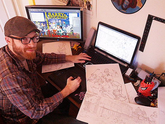
 I was so happy with my illustrator, Joe Dodd, I begged him to send me a “bio” on himself so I could put up a page on the site. Here’s what he sent:
Joe is a freelance illustrator with a wide range of disciplines. Classically trained at The American Academy of Arts in Chicago as an oil painter and digital illustrator, he works out of his home in Illinois. With clients like Marvel Entertainment, DC Comics, Hasbro Inc., and Dreamworks Studios to name a few, he continues to do what he loves every single day. Make art.
What he didn’t mention was how awesome he was to work with. I didn’t just give Joe a blank slate and say, “Make me a pretty cover.” No. I’m one of those guys who had an idea of what I wanted the cover to look like, and we’re much more dangerous to work with.
I sent Joe a 2-page description of the idea I had for the cover. I could feel him cringe over the email waves. Here are some excerpts from that email:
What I’m going for is mayhem … a plane falling from the sky in the distance, a car crash, buildings smoking and/or on fire, people running, etc.
Cityscape will probably be blurred out and darkened some so don’t worry about too much detail, although for the Kickstarter video, I may use the detail. At the top will be the title written all the way across taking up about 2-3 inches. And along the bottom there will need to be room for “Ross Cavins” in big letters taking up about
an inch or so.
Barry is ambivalent about the chaos going on around him. He’s bored, thinking “Not again. Do I really have to? I was going to get a haircut today.” His mask (attached to his uniform at the back and sides) is pushed off his face, resting like a hoodie on his back
You should have a pretty redhead with medium-length hair and light freckles (Kimmy) and a scrawny “accountant” character (Gordon) with thick round glasses. She’s in a modest pants suit and blouse, and he’s wearing khakis and a button-down shirt. There’s also a hot, curvy redhead to their left (Samantha) who’s a little taller. She should be in a sexy dress. They’re all on the left side facing right.
And so on … I think you get the idea … I was very specific about many things. But I also understand what it’s like to be in his shoes. Being in charge doesn’t mean telling everyone what to do; it means you hire the best people for the job, give them some direction, and get the hell out of their way.
So, I also told him this (paraphrased):
Feel free to add/delete from it as you see fit … this is just a guide – have fun with it.
And Joe knew exactly what to do from there. He had fun.
After a few days, he told me he envisioned seeing Barry on the cover in a pose somewhat like Bruce Campbell in the movie poster for Army Of Darkness. I had to Google to find it … and when I did, I was floored. Joe took my original vision, and fed it a bacon sandwich with extra bacon and a side of bacon.
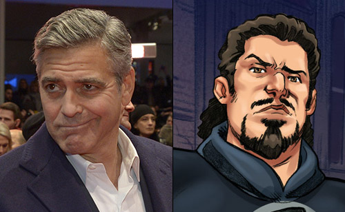
 I then found a picture of George Clooney on the net and sent it to him.
“I want Barry to have an expression of incredulity and bemusement, like this,” I wrote to him. “Like he’s saying, ‘Can you believe this guy?'”
I don’t know about you, but I think Joe nailed it.
He didn’t just copy the expression; he drew it. He gave Barry more attitude. He gave Barry a soul.
Here’s another thing Joe didn’t tell you in his bio above: He read the whole book.
Joe wanted to get a feel for Barry so I sent him the first three chapters. Then he asked for the rest.
He wanted to get a complete picture of Barry, not just an idea. He wanted Barry to come to life in his mind so he could do the character justice. And honestly, he told me I’d hooked him with those first three chapters.
*shoves feather in cap*
Joe came up with the idea of the burning money floating in the air. It was perfect and matched the theme of the book.
He put the 3-wood into Gordy’s hand, and I loved it so much I wrote it into the book! Notice the detail in Gordy’s grip? His pinkie and first finger are interlocked. Awesome sauce.
Joe also came up with the idea of sticking the Anunnaki sign on the book somewhere. Perfect!! I later expanded that idea and added it several places on the cover after he was done.
What I’m trying to say by all this is, if you’re looking for an illustrator, Joe Dodd is your man.
You can find more of his projects on his tumblr page.